
This post assumes you have beginner to intermediate JavaScript & Vue knowledge, have heard of, or have basic knowledge of preprocessors.
It’s already old news by now that Vue has a very small learning curve that allows any or almost anyone to jump right into learning with little or no hiccup. Vue’s out-of-the-box support for preprocessors also adds to this easy learning curve.
You might be coming from an SSR (Server Side Rendering) background, where views are rendered from the server-side with their associated data. As opposed to Client-rendered applications where everything is rendered client-side. SSR introduces you to a handful of templating engines that lets you render dynamic data from the backend in your views.
here’s a good read you could check out to understand the differences between Server-side and Client-side rendered applications.
If you have a bit of Nodejs SSR background, you would already be accustomed to templating libraries like Pug, Handlebars, EJS, etc. If you’re from a PHP background you would be familiar with the Blade templating engine. These templating libraries basically help you render dynamic data from the backend on the frontend. They also help you generate markup with loops based on conditions.
With Vue Single File Components (SFC), we can use preprocessors such as Pug, Babel (with ES2015 modules), and Stylus for cleaner and more feature-rich components. Some of them make writing HTML “easier”: like pug for example (which we’d be using). A typical pug syntax would look like this:
- var list = ["Able", "Cain", "Judas"]
each item in list
  li= item
Which renders to:
<li>Able</li>
<li>Cain</li>
<li>Judas</li>
What you would notice is that we can have contents rendered from dynamic arrays into an HTML list without having to manually do it.
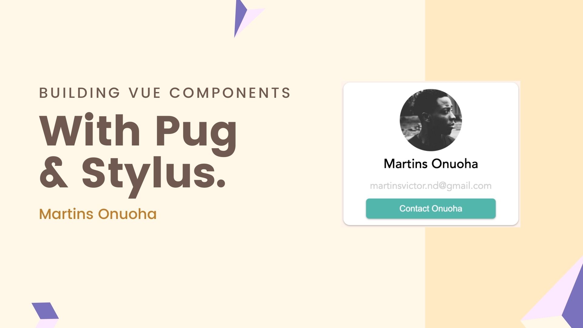
What We’ll be building
We’ll be building a simple contact card component and duplicate it across our page with a for-loop and populate it with content.
Getting Started
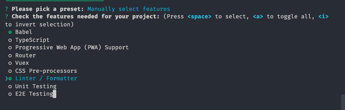
We’ll start by spinning up a Vue application using the vue-cli. I’ll use the default options and continue with scaffolding the application. Projects created by Vue CLI are pre-configured with most of the common development needs working out of the box.
Note: “working out of the box” means you wouldn’t need to do any extra configuration to start working with these tools, however, you would need to install the necessary preprocessors and corresponding loaders as Vue wouldn’t install these by default if you do not need them. We’d need pug-plain-loader and stylus-loader.
In webpack, all pre-processors need to be applied with a corresponding loader. vue-loader allows you to use other webpack loaders to process a part of a Vue component. It will automatically infer the proper loaders to use based on the lang attribute of a language block and the rules in your webpack config.
- vue-loader docs
Create a new Vue application.
vue create vue-pug
Once that’s done, you can open up the application folder in your code editor. I’ll be using VScode.
cd vue-pug
code .
Using Preprocessors
To use pre-processors, we would need to install those preprocessors and their corresponding loaders. The two preprocessors we’d be using are pug and stylus.
yarn add --dev pug pug-plain-loader
Next, we install stylus.
yarn add --dev stylus stylus-loader
Stylus allows you to write CSS in a more reusable, concise robust manner. Here’s what that would look like:
textarea, input
  border 1px solid #eee
body
  color white
this renders to:
textarea,
input {
  border: 1px solid #eee;
}
body {
  color: #fff;
}
This should give you a bit of familiarity when we get into building out our component.
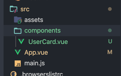
For our component, we’d create a new file called UserCard.vue, within the components folder. This file would house our card components and take in the necessary props.
In our template section, within the Usercard.vue file, we need to first set the templating language to pug, then structure our elements in pug style.
<template lang="pug">
  .user-card-component
    .user-card-component__avatar
      img(:src='`${avatar}`' class='user-card-component__avatar-image')

    .user-card-component__name {{ username }}

    .user-card-component__email {{ email }}

    .user-card-component__action
      button(@click="$emit('contactUser')") Contact {{ lastName }}
</template>
A Bit About Pug Syntax
In our component above, we’ve created a parent class “user-card-component” that has four child classes; __name, __email, __action. You would notice we didn’t use traditional div tags, this is because pug’s Class Literal syntax allows us to define classes and omit the tag name, that Since div’s are such a common choice of tag, it is the default if you omit the tag name.
Our template structure above compiles to:
<div class="user-card-component">
  <div class="user-card-component__avatar">
    <img src="" class="user-card-component__avatar-image" />
  </div>
  <div class="user-card-component__name">
    John Doe
  </div>
  <div class="user-card-component__email">
    [email protected]
  </div>
  <div class="user-card-component__action">
    <button onclick="func">Contact John Doe</button>
  </div>
</div>
Next, we need to update the script part of our component to accept the necessary props and add a computed property to get the last name of the contact person.
<script>
export default {
  name: 'user-card-component',
  props: {
    avatar: {
      type: String,
      required: true,
      default: '',
    },
    username: {
      type: String,
      required: true,
      default: 'Martins Onuoha',
    },
    email: {
      type: String,
      required: true,
      default: '[email protected]',
    },
  },
  computed: {
    lastName() {
      return this.username.split(' ')[1];
    },
  },
};
</script>
Our Card component expects 3 required props; avatar, username, and email. We’ve also added a lastName method to return the last name of the user.
Finally, we need to style our component using Stylus. Still, within the Usercard.vue component, we’ll add a style section and set the language type to “stylus”.
<style lang="stylus">
  shdw = 0 1px 3px rgba(0,0,0,0.12), 0 1px 2px rgba(0,0,0,0.2)
  .user-card-component
    box-shadow shdw;
    background-color #ffffff
    border-radius 10px
    padding 10px
    width 70%
    margin 0 auto
    &__avatar
      &-image
        border-radius 50%
        width 6rem
    &__email
      font-size 15px
      padding 10px
      color #CCC
    &__name
      font-size: 20px
      font-weight 500
    button
      padding 8px
      background #4DB6AC
      color #FFF
      width 80%
      border-radius 5px
      box-shadow shdw
      border 0
    .spacer
      border-color #CCC
</style>
Stylus lets us omit braces and semicolons in our styling, create variables, and use nested selectors. This should be enough to design our card component. Next, we’d update the App.vue to use Pug and Stylus, import, and use our card component with some static data.
In App.vue, replace the existing content with this:
<template lang="pug">
  #app
    div.col(v-for="user in users")
      UserCard(
        :avatar='user.avatar'
        :username='user.username'
        :email='user.email'
      )
</template>

<script>
import UserCard from './components/UserCard.vue';
export default {
  name: 'App',
  components: {
    UserCard,
  },
  data() {
    return {
      users: [
        {
          avatar: 'https://avatars0.githubusercontent.com/u/29035007?s=460&u=d43c9fdb7ae872c84a38aa6a0c04db49cb7e59f4&v=4',
          username: 'Martins Onuoha',
          email: '[email protected]',
        },
        {
          avatar: 'https://avatars2.githubusercontent.com/u/2798204?s=460&u=d5b35f5a43986232e2d226539071ec1008db5166&v=4',
          username: 'Guillaume Chau',
          email: '[email protected]',
        },
        {
          avatar: 'https://avatars3.githubusercontent.com/u/499550?s=460&u=de41ec9325e8a92e281b96a1514a0fd1cd81ad4a&v=4',
          username: 'Evan You',
          email: '[email protected]',
        },
        {
          avatar: 'https://avatars2.githubusercontent.com/u/3277634?s=460&v=4',
          username: 'Haoqun Jiang',
          email: '@haoqunjiang',
        },
      ],
    };
  },
};
</script>

<style lang="stylus">
body
  background-color: #FFF4EC
#app
  font-family: Avenir, Helvetica, Arial, sans-serif
  display flex
  justify-content: center;
  text-align: center
  margin-top: 60px
  .col
    width 100%
</style>
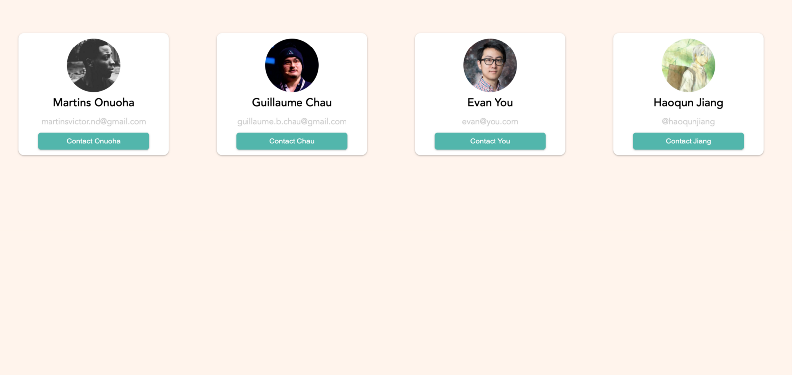
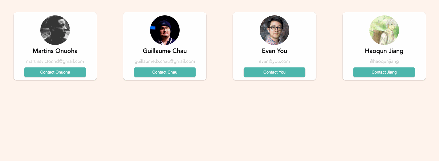
We’ve imported the UserCard component, looped through our static data (an array of user objects), and generated a UserCard for each of them, passing in the required props. Let’s see what we have now.
yarn serve
This should build and serve our vue application on localhost:8080
Hopefully, this should help you understand how to use preprocessor with Vuejs. Here’s a link to the repo to serve as a starter.
Cheers ☕️