

Tailwind is a utility first CSS framework that gives developers full control over styling web components. Unlike component frameworks or libraries, Tailwind doesn’t restrict you to preexisting components that are tweakable via props and options, with Tailwind, you build from the ground up, using utility classes in their smallest form.
Sheesh! But I’d rather have someone else do the job, I like component libraries better. Well, there’s Headless UI — completely unstyled UI components that integrates well with Tailwind CSS (their words, not mine).
Last Month Adam Wathan (Creator of Tailwind) announced the biggest updates to Tailwind CSS - The Tailwind JIT.
One major highlight about this update is that you now get to write less custom CSS. Let’s understand how that works.
With Tailwind, we would usually start out by setting up our themes and variants within the tailwind.config.js file. Something like this:
module.exports = {
  theme: {
    colors: {
      gray: '#CFD8DC',
      blue: '#2196F3',
      red: '#EF5350',
      pink: '#F48FB1',
    },
    fontFamily: {
      sans: ['Graphik', 'sans-serif'],
      serif: ['Merriweather', 'serif'],
    },
    extend: {
      spacing: {
        '128': '32rem',
        '144': '36rem',
      },
      borderRadius: {
        '4xl': '2rem',
      }
    }
  },
  variants: {
    extend: {
      borderColor: ['focus-visible'],
      opacity: ['disabled'],
    }
  }
}
The theme section is where we customize anything related to the visual design/design system of our site. Here we can specify our color palette, font family, border-radius sizes, and the likes.
Without customization, Tailwind comes with specific values for all of these style properties, like colors for example.
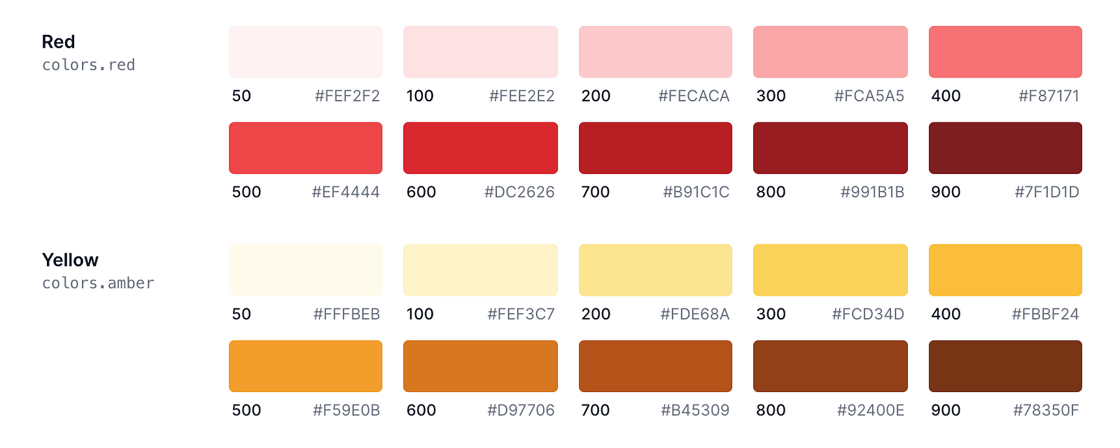
Looking at this chart we know that we can customize 10 shades of the color “Red”, the problem, however, comes in when we need say one or two additional shades (insatiable humans, eh?). Of course, Tailwind’s configuration file can help us achieve this:
// tailwind.config.js
module.exports = {
  theme: {
    extend: {
      colors: {
        red: {
          350: '#E53935'
        },
      }
    }
  }
}
We shouldn’t have to do this if we only need these shades in one or two parts of our application, and they aren’t necessary for theming. This is where Arbitrary Styles with Tailwind JIT compiler come in. With Arbitrary Styles, you can specify the hyper-specific style you need on elements without needing to update it in your config file…Yes, Sam, you can now get rid of those inline style attributes 👀.
Let’s put this to a test. I’ll spin up a Vue project and install Tailwind, after that, we’d set up JIT mode. Note that you can do this with whatever Javascript frontend framework you work with. Tailwind is framework agnostic.
Psst! Here’s a Vue and no-framework setup for Tailwind:
vue create tailwind-ab-styles
Navigate into the project directory:
cd tailwind-ab-styles
Install and Set up Tailwind CSS. Here’s a quick guide to set up Tailwind CSS in your Vue project here:
After setting up Tailwind, you can enable JIT by updating your tailwind.config.js and changing the “mode” property to “JIT”.
module.exports = {
  mode: 'jit',  // update this line
  purge: ['./index.html', './src/**/*.{vue,js,ts,jsx,tsx}'],
  darkMode: false, // or 'media' or 'class'
  ...
};
Let’s spin up the Vue server and see what this looks like.
yarn serve
You might get a similar warning from the bundler about the JIT engine currently in preview when you start the server.

Using Arbitrary Styles
I’ve updated the App.vue file, to a simple markup with basic Tailwind classes.
<template>
  <div class="justify-center flex bg-yellow-300 items-center h-screen">
    <div class="text-4xl">
      Hello 👋🏼
    </div>
  </div>
</template>

<script>
export default {
  name: 'App',
};
</script>
Result:

In the markup above notice, we have a text “Hello” with a div of class “text-4l” wrapped around it. Tailwind provides 10 “font-size” utility classes that we can use, and their values range from 0.75rem to 8rem. Say we wanted just this text to be size 9rem, with arbitrary styles we don’t have to configure another utility class for this case, instead, we do this:
<div class="text-[9rem]">
  Hello 👋🏼
</div>
And there you have it, a huge text of size 9rem. This saves us the pain of littering our mark-up with inline styles.

Let’s add in a box below the “hello” text and set its width, height, and background color using Arbitrary values.
<div class="w-[300px] h-[200px] bg-[#FFECB3] rounded-[20px] ml-[40px]"></div>

We can also use this for screen variants as well.
<div class="w-[300px] h-[200px] md:bg-[#FFECB3] rounded-[20px] ml-[40px] lg:ml-[-400px] lg:mb-[430px]"></div>

This also works for grids and layouts as well, check out the documentation for advanced applications.
Limitation
You can only
@applyclasses that are part of core, generated by plugins, or defined within a@layerrule. You can’t@applyarbitrary CSS classes that aren’t defined within a@layerrule. — docs
@apply is a directive used to inline an existing utility class into your custom CSS. Currently, this is the only known limitation with arbitrary values. Have fun tinkering with it.
Cheers ☕️